Color and Type Considerations
Whether you’red designing a webpage or creating a PDF or an event poster, it’s important to make color choices with readability in mind.
Color Contrast
Color contrast is very important to legibility. To meet current accessibility standards, use only approved color combinations. Be sure to take special care with reverse type and type overlays.
Web Content Accessibility Guidelines (WCAG) require a contrast ratio of at least 4.5:1 for normal text and 3:1 for large text to achieve Level AA compliance. Large text is defined as 14 point (typically 18.66px) and bold or larger, or 18 point (typically 24px) or larger.
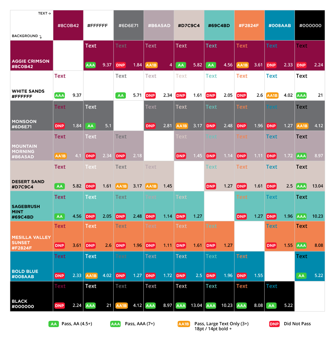
This chart below "grades" various combinations of NMSU brand colors. NMSU's goal is to achieve Level AA compliance. The red "DNP" tags means a particular combination Does Not Pass — don't use those combinations. Download PDF version of the Brand Color Contrast Chart.
Tip: Don’t rely on color alone to convey meaning. Use icons, written content, and other visual elements to reinforce clear communication of the content.
Testing Contrast
For websites and other online media, use a web color contrast checker to assure that your content meets WCAG compliance.
What about printed media?
For printed materials, web contrast standards are hard to measure. Try a test print in black and white in order to observe contrast and legibility. Use the following guidelines when designing print media.
- Use a text/background color combination with stark contrast
- Use a non-glossy matte paper, white or off-white
- Double-sided documents should be printed on heavier paper
Tip: When creating a digital document such as a PDF, don’t rely on color alone to designate links in case the document is switched to grayscale.
Type Considerations
In general, it’s best to take a simple and clear approach to your typography and font choices when you design for both digital and print media. In general take careful consideration when using background textures, colors or graphics that make overlay text hard to read. Make sure to also use italics, bold, and underline selectively and avoid using these types of font treatments for an entire paragraph. Use center-aligned text sparingly and only when text is fewer than three lines as left-aligned text is much easier to read.
For websites and online media
- Use default system fonts on the web. Your operating system will determine the typeface:
- Helvetica (Mac OS, iOS)
- Arial (Windows OS)
- Open Sans (Chrome OS, Android OS)
- Headlines should always convey the content hierarchy: think of your headlines and subheads as the chapters to your page.
- Use short copy and bulleted lists rather than big blocks of text. This is easier for all readers to scan and it improves accessibility for users who depend on screen readers.
- Use Descriptive Links:
- Make sure that your links use descriptive language to signal the destination. e.g. “Learn more about financial aid options” instead of “Learn More”
- Links should stand on their own
- Use 16px minimum for body type. Pages should be resizable up to 200% with no loss of legibility or functionality.
- The line length of content text should be no more than 80 characters or glyphs.
- Use actual text whenever possible, rather than graphic text. Text in images cannot be seen by search engines, screen readers and other assistive devices.
For print designs and documents
- For optimum legibility, line spacing (leading) should be at least 1.5 within paragraphs, and spacing between paragraphs should be at least 1.5 times larger than the line spacing.
- Page margins should be at least 0.5 on all sides
- Column spacing should be at least 0.5
- At least 12 point text (14 point when possible)
- 18 point text size for printed materials